Katie Wilhelm
Designer and Consultant
Branding and Graphics for a University Talent Accelerator Program
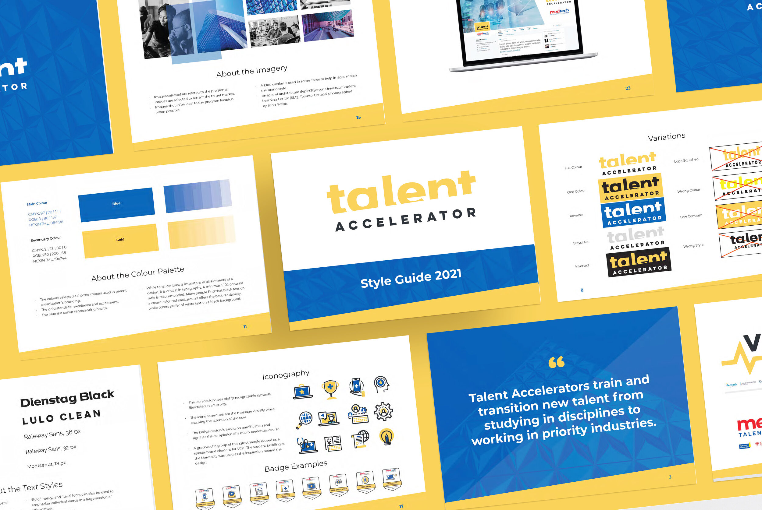
“Talent Accelerators train and transition new talent from studying in disciplines to working in priority industries.”
About the Logo and Brand Design
This logo was designed to be in line with existing program branding for a cohesive brand presentation.
The accelerator bar used in the logo and in graphic elements represents growth and higher learning. This along with the architecture of the parent organization’s building inspired the use of triangles as a brand element. The accelerator slanted edges are used on graphic elements to provide a fun branding element for more emphasis on this theme.
The colours used echo the colours used in the parent organizations’ branding. The gold stands for excellence and excitement and the blue is a colour representing health.
Iconography
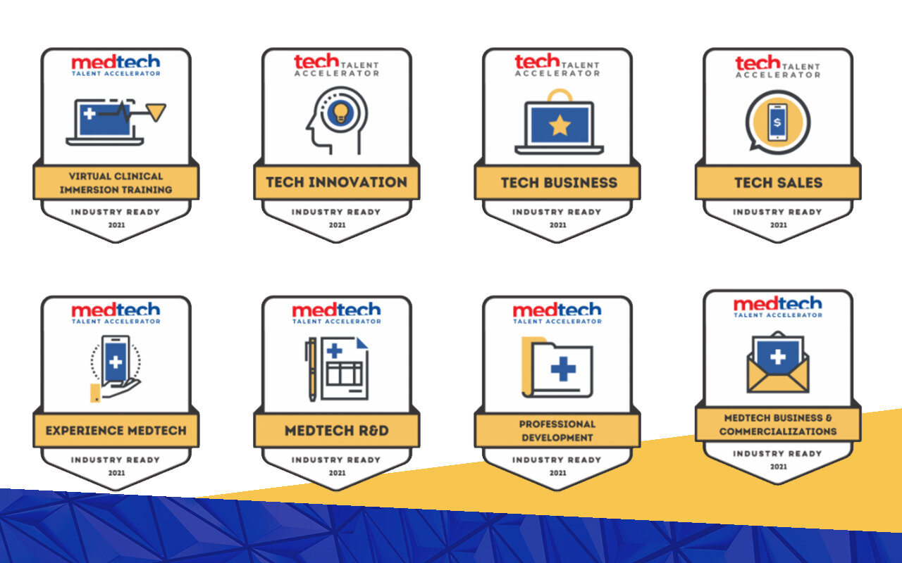
The icon design uses highly recognizable symbols illustrated in a fun way. The icons communicate the message visually while catching the attention of the viewer. The badge design is based on gamification and is an award received upon the completion of a micro-credential course.
A graphic of a group of triangles triangle is used as a special brand element for VCIT. The student building at the university was used as the inspiration behind the design.
Services
Logo and Brand Design
Brand Guide
Badge Design and Illustration
Social Media Page Graphics
Website Graphics


