Katie Wilhelm
Designer and Consultant
Logo Design that Visually Roots SISCO in its Origins to its Global Audience
“SISCO & Associates Consulting Services Inc. partners with Katie Wilhelm Graphic Design, an Indigenous Graphic Design firm, across many projects to create culturally safe and accessible graphic summaries and to bring reports and presentations to the next level. Katie is also the creative behind SISCO’s logo and branding.”
The Project
SISCO & Associates Consulting Services Inc., a specialized consulting firm focusing on Indigenous community-based consulting, is refreshing its visual identity. As it expands its reach into diverse communities globally, encompassing First Nations, newcomers, 2SLGBTQ+, equity-deserving, underrepresented, and marginalized groups, among others, SISCO aims to embody a decolonizing and intersectional approach.
Central to this endeavour is the desire to highlight the diversity and strengths of its team. The design directive is clear: maintain professionalism, cleanliness, and modernity while ensuring accessibility and a local touch. The update should seamlessly integrate with previous materials, offering a cohesive look rather than a complete rebranding.
Suggestions include exploring colour updates, such as transitioning from teal to green, as illustrated in the provided colour palette example, and font updates focusing on accessibility. Additionally, incorporating natural elements, such as florals, leaves, seeds, or water, into the "O" of SISCO is encouraged to enhance further the brand's connection to the environment and its values.
The Design
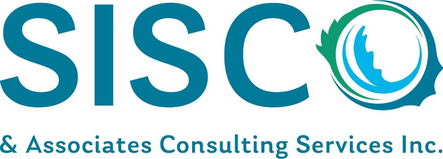
The SISCO Logo design illustrates the company's mission, vision, and values in the Sisco Earth Wreath icon.
The Leaves: The logo features a graphic of oak, evergreen, and birch leaves. These leaves are native to the region Sisco originated from. The local flora illustrates a “starting at home” point of view. The different varieties of local flora also demonstrate diversity and represent various levels of the forest canopy, where each level is individual yet equally important. The leaves were selected because these species are adapted to the local climate and are hardier than non-native species.
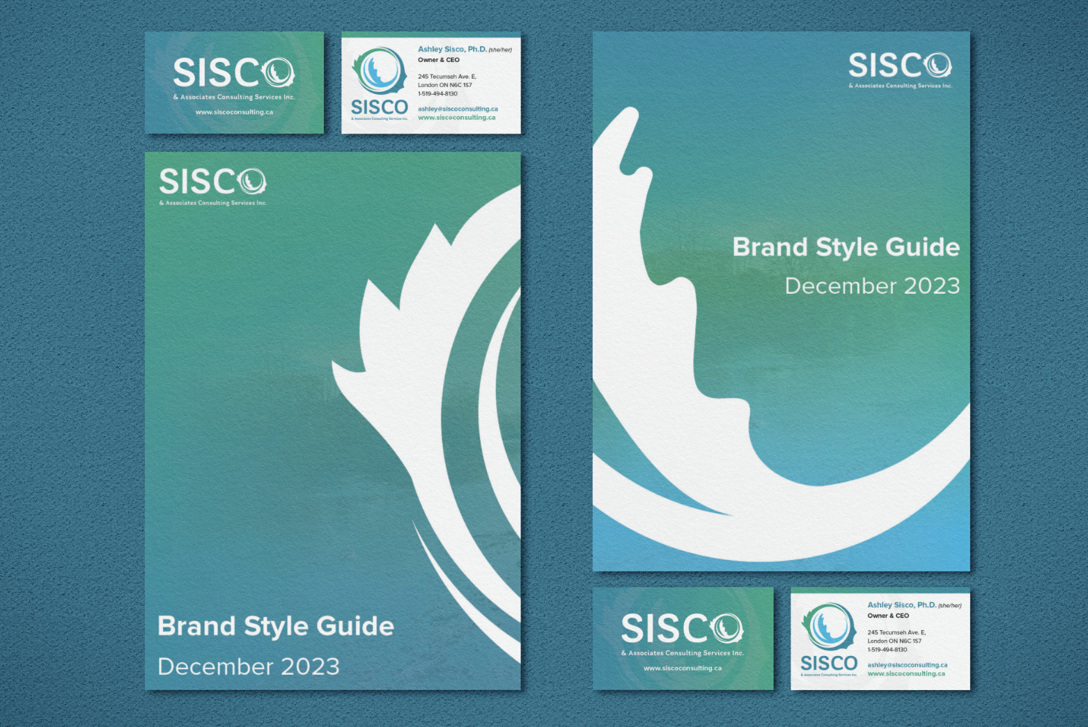
The Earth Shape: The leaves connect and overlay each other to create an Earth-like shape with the nature-based colours of blue and green, sampled from a photo of a local park (Westminister Ponds). The circular Earth Wreath replaces the "O" in "Sisco" in the primary logo and appears as a Brand element in the company's visual material.
Company Values: The leaf shapes illustrate growth, with each growing larger in the circle. The variety and intersection of the leaves represent the diversity and strengths of Sisco's team and partners. The logo illustrates their inter-sectional approach to growth while also nodding to their first logo using three intersecting shapes.
The Sisco Earth Wreath Logo represents Sisco & Associates Consulting and visually roots the company in its origins and values to its global audience.
Testimonial
“SISCO partners with Katie Wilhelm Graphic Design, an Indigenous Graphic Design firm, across many projects to create culturally safe and accessible graphic summaries and to bring reports and presentations to the next level. Katie is also the creative behind SISCO’s logo and branding.”
Services
Logo Design
Stationary Design
Report Design
Indigenous-lens Consultation


