Katie Wilhelm
Designer and Consultant
Logo and Brand Design for a Long Lasting Foundation
“Working with Katie was an absolute pleasure... the final deliverables were completed ahead of schedule! I look forward to working with Katie on future projects!!”
“The first draft of the logo design was approved unanimously by nine separate stakeholders.”
About the Project
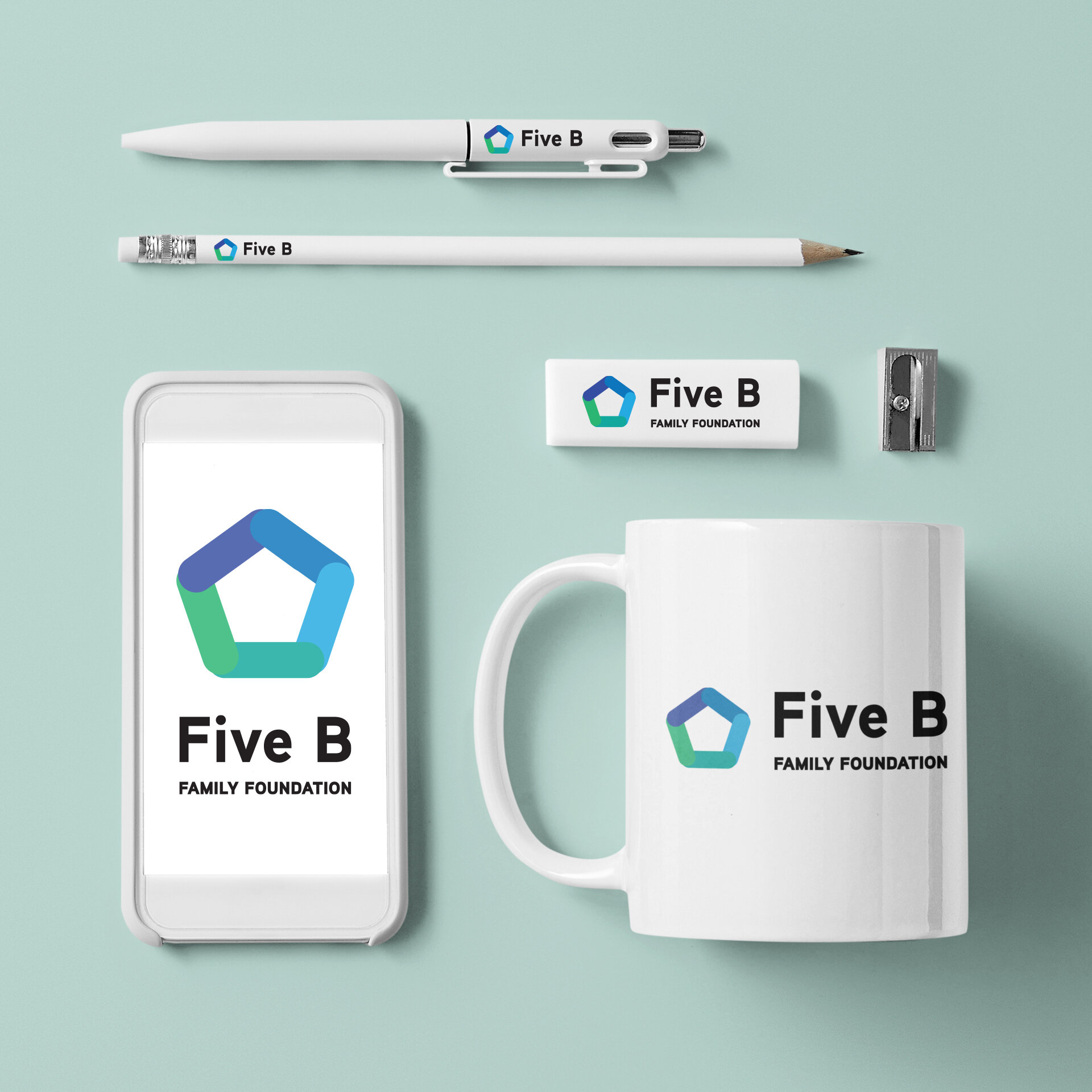
The Five B Family Foundation is a charity that supports charitable activities in Eastern Ontario. The organization needed a professional and classy logo mark and stationery set for its corporate activities.
The project's goal was to create a long-lasting brand identity for the Five B Family Foundation that encompasses the company's mission, vision, and values.
About the Process
Starting from the ground up with no existing marketing or graphic material, I conducted industry and market research, including studying the branding of stakeholders and lookalike organizations.
The design themes for the brand are "Foundation," "Family," and "Five."
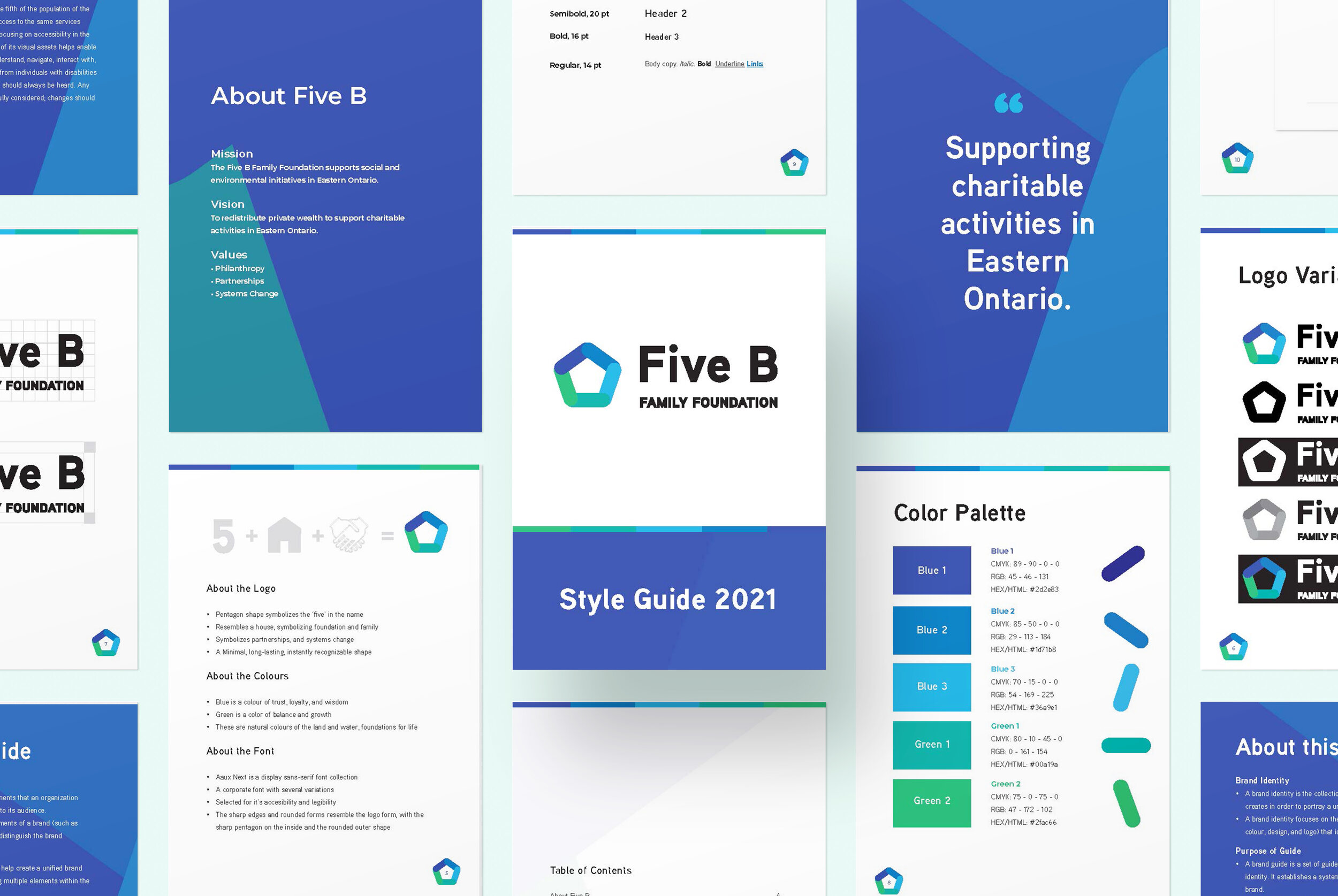
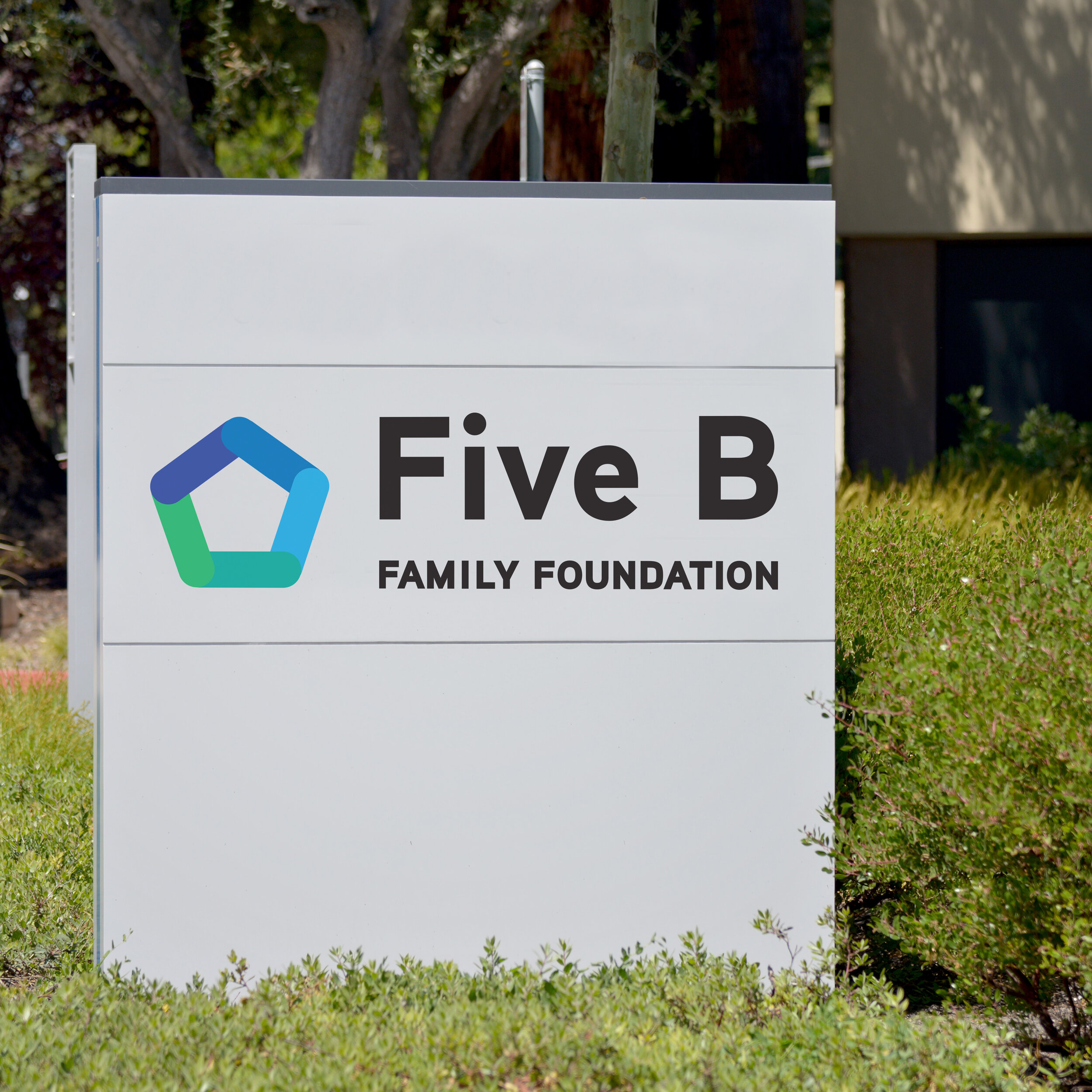
The pentagram shape was selected for its five sides, representing the 'five' in the name. The pentagram also resembles a house, symbolizing foundation and family. It is a minimal representation and an instantly recognizable symbol.
The five coloured pillars symbolize the partnerships between the five founding members of the organization. The connected shapes represent partnerships and systems change.
The colours also play an essential role in the brand design. Blue is a colour of trust, loyalty, and wisdom, and green is a colour of balance and growth. These are natural colours of the land and water, which are foundations for life in the Indigenous ways of knowing.
The font selected is Aaux Next, a sans-serif display font collection. This corporate-style font was chosen for its accessibility and legibility. The sharp edges and rounded letterforms resemble the logo icon, with both sharp and rounded letters in the typeface.
The Results
The first draft of the logo design was approved unanimously by nine separate stakeholders.
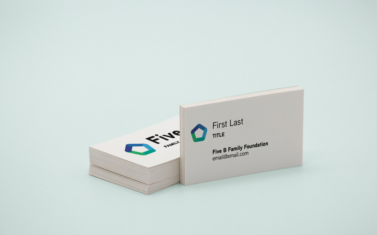
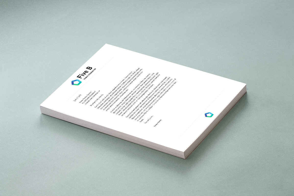
The final deliverables included the logo design in print and web formats, letterhead design, business card design, and a brand style guide. These materials were completed and delivered ahead of schedule.
The clean, classic logo and branding have set this established Foundation up for becoming more transparent and public-facing in the future.
Services
Logo and Brand Design
Brand Guide
Stationary Package
Testimonial
“Working with Katie was an absolute pleasure. Not only did she deliver a first draft that NINE separate stakeholders agreed on unanimously, the final deliverables were completed ahead of schedule! I look forward to working with Katie on future projects!!”

