Katie Wilhelm
Designer and Consultant
Visually Representing the Values of Astoria Pictures
“Working with Katie Wilhelm was a dream... Katie’s work is simply best-in-class and I would highly recommend her services to any business or professional in any sector without a moment’s hesitation.”
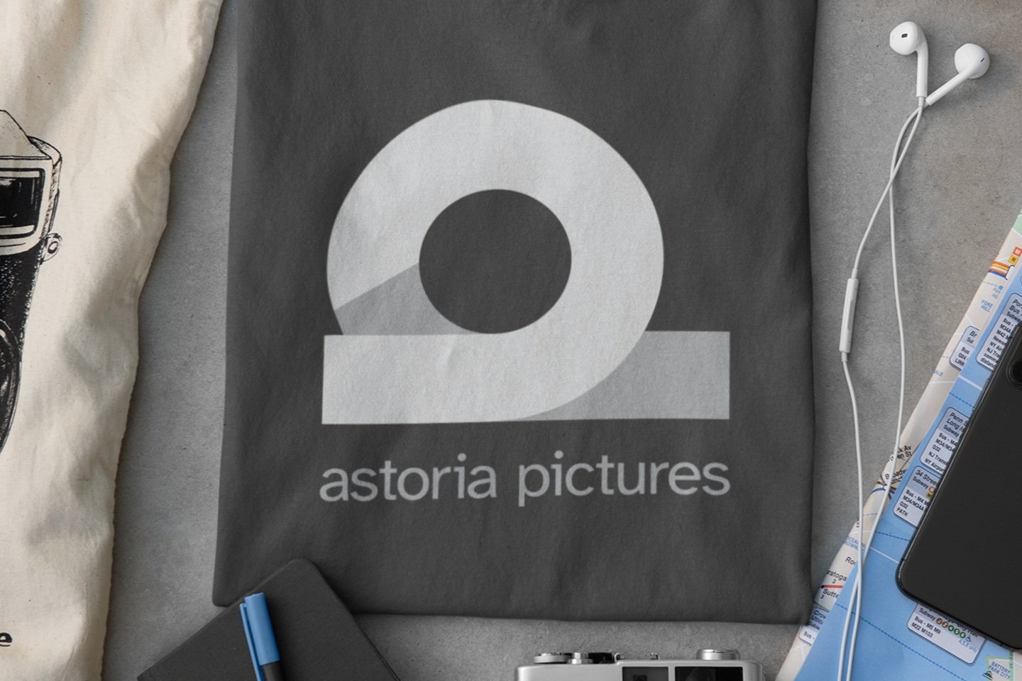
Astoria Pictures is a film production company. The logo features a symbol that represents the brand values of Astoria Pictures and the founder.
About the Symbol
The symbol is a minimal design with multi-layered concepts, drawing from the founder’s childhood home, to sound theory, and to the nature of the company: film. Together, these symbols form the icon to represent the brand values of Astoria Pictures and the founder and illustrate the idea of “the universal through the personal.”
The Street Shape
The name Astoria comes from the name of the cul-de-sac of the founder’s childhood home. The logo’s icon design comes from the idea behind this quote by James Joyce, as recalled during a consultation with the founder - If you describe an intersection from your childhood home with detail, it will be universally recognized as the crossroads of everyone around the world. This quote formed the design concept of a street.
Incorporating Sound and Movement
The symbol also resembles an OHM, a unit of electrical resistance. The sound OHM is called “the first sound of the universe” and is also considered a sacred sound. This adds a multi-sensory element to the logo as well as a spiritual connection. The symbol also resembles a film reel. These two themes encompass the nature of Astoria Pictures as a film company.
More Symbols
The symbol is created from the shape of an A and P, the starting letters of the business name. These letters intersect to form a shape similar to a cul-de-sac, an OHM symbol, a film reel, and an infinity symbol - or a möbius strip.
Services
Logo Design
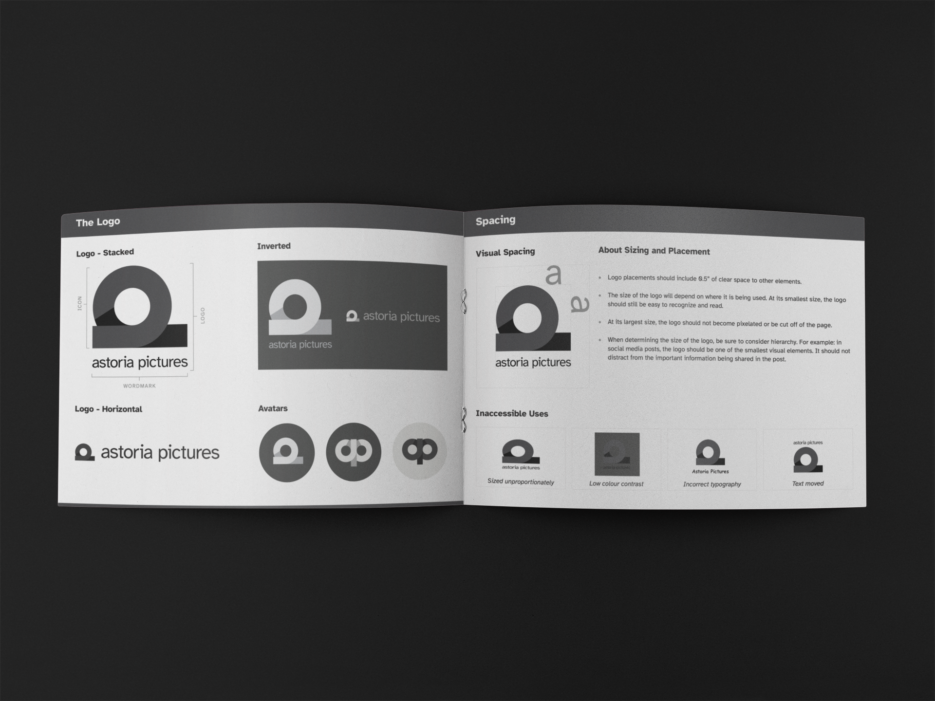
Brand Guide Design
Testimonial
“Working with Katie Wilhelm was a dream: she is an extremely careful and present listener, a consummate professional (timely, clear, agile), and brings incredibly rich visual and symbolic intuition to her practice as a designer and marketing consultant.
Katie’s work is simply best-in-class and I would highly recommend her services to any business or professional in any sector without a moment’s hesitation.”


